Analytics
Welcome to the Threedium Platform analytics documentation. As of version 2.14.4, our platform offers a new comprehensive analytics suite designed to help you understand user engagements, measure performance, and gain insights into how your 3D experiences are interacting with your audience.
Within the Threedium Platform, various standard events such as page views and impressions are automatically captured, providing you with essential metrics right out of the box. These metrics are readily available for review in an intuitive dashboard that serves as the command center for all your analytics needs.
Beyond the default event tracking, Threedium Platform offers the flexibility of custom event tracking. Custom tracking requires technical implementation handled by developers who craft your 3D experiences. This advanced feature allows for the creation of bespoke analytics tailored specifically to your requirements, enabling you to capture unique interactions that matter most to your business.
Instructions on how to implement custom event tracking can be found here: LINK
This portion of the documentation is designed to familiarize you with the Threedium Platform analytics dashboard. You will learn the ins and outs of the interface, understand where to find specific metrics, and how to interpret the various reports at your disposal. Whether you are a marketer analyzing user behavior or a product manager looking to refine functionality, this guide will equip you with the know-how to leverage the full power of analytics within the Threedium Platform.
Setting Up Your Analytics Report
Selecting Projects and Workspaces
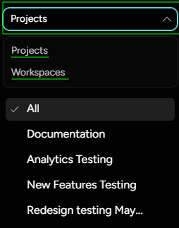
Before diving into data and reports, the first step is choosing specific projects or workspaces for which you want to analyze the analytics.
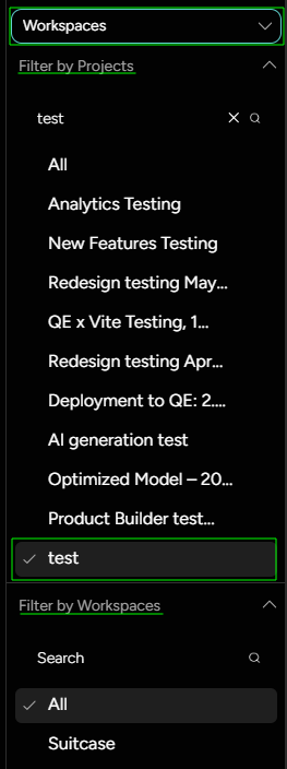
Navigate to the the right side of the dashboard, and choose to filter through projects or workspaces.
You will see a list of all the projects you have access to. Click on the projects you are interested in to view its specific analytics.
If Workspaces is selected, then filtering through both is available, and users can select specific workspaces to combine the reports for.
Configuring the Date Range
Once you've selected a project, configuring the time frame for your report is crucial for obtaining relevant data. Here's how to set up the date range:
Look for the 'Calendar' icon in the top right corner of the analytics dashboard to choose the time frame. Select the start and end dates for the period you wish to analyze. This could range from a single day to several months, depending on your needs. After choosing the dates, apply the changes to update the reports and data visualizations accordingly.
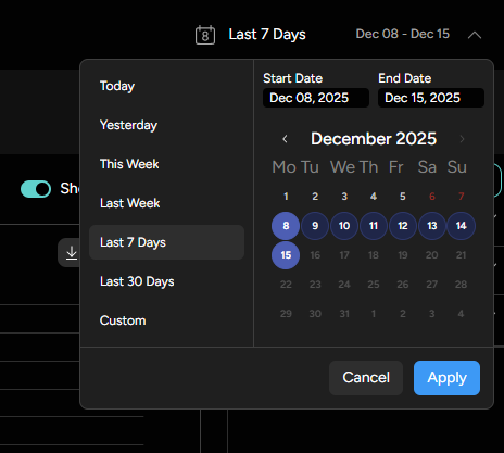
By selecting projects and/or workspaces and configuring the date range, you're now ready to view and analyze the analytics data that will help inform your decisions and strategies for your 3D experiences.
Dashboard Overview
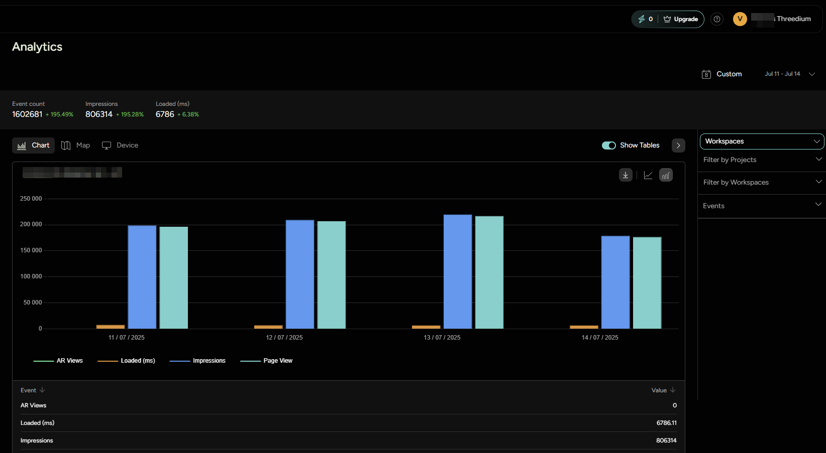
The dashboard Overview provides a snapshot of critical metrics for your selected reporting period, offering quick access to performance indicators at a glance.
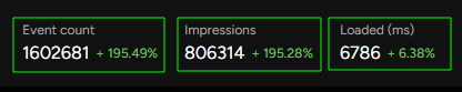
This section contains three primary information points:
Event Count: Represents the sum of all selected events tracked during the selected time frame.Impressions: Indicates the total number of times your 3D content was accessed by users.Average Loading Time: Shows the average time it takes for your 3D models to load across all user interactions.
Beside these metrics, you'll find a percentage change that compares the data against the previous equivalent period. This gives you an immediate sense of trends, whether there's been an increase or decrease in activity. The comparison is automatically calculated and presented as a percentage that reflects the difference in metrics.
For example, selecting a 3-day period will juxtapose the current data with the previous 3-day span:
- Event Count: +50% (indicating a 50% increase in the number of events compared to the previous period)
- Impressions: -10% (showing a 10% decrease in impressions)
- Average Loading Time: +20% (implying that the loading time has increased by 20%, which may warrant further investigation into performance issues)
This at-a-glance overview empowers you to quickly assess the effectiveness of your content and identify areas that require attention or optimization. It streamlines the process of monitoring your content's performance over time, keeping you informed and agile in your strategy.
Customizing Report Events
In the Threedium Platform analytics dashboard, you have the ability to tailor your reports by selecting specific events that are most pertinent to your analysis. Customizing which events to track and review in your report is essential for gaining focused insights into the user interactions that align with your objectives.
When implementing tracking, developers have the ability to categorize events to streamline the organization of metrics within the dashboard. Each event must have a unique name to be counted individually, however, developers can also assign a category to each event. This categorization helps in curating organized and efficient reports. By leveraging these categorized events, you can quickly navigate to the metrics that matter, and better comprehend the user behavior affecting your project's success.
On the right sidebar, navigate to the section Events - open it and find different categories listed, as well as events within those categories.
Default events
Some events are being tracked by default, without a need for additional implementation by the developer:
- Page Views
- Impressions
- AR Views
- Average Loading Time - defined in ms
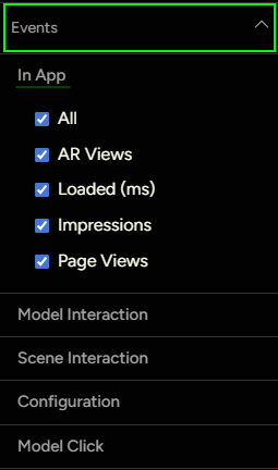
These events will be categorized as In App events.
Custom Events
As mentioned before, developer can define a category for each event. These categories will be listed within the dashboard, with events listed beneath each one. User can then select the events that should be included in the report. Depending on the 3D creative that was built, different events can be tracked for gaining insights.
Here is an example of setting up custom events tracking:
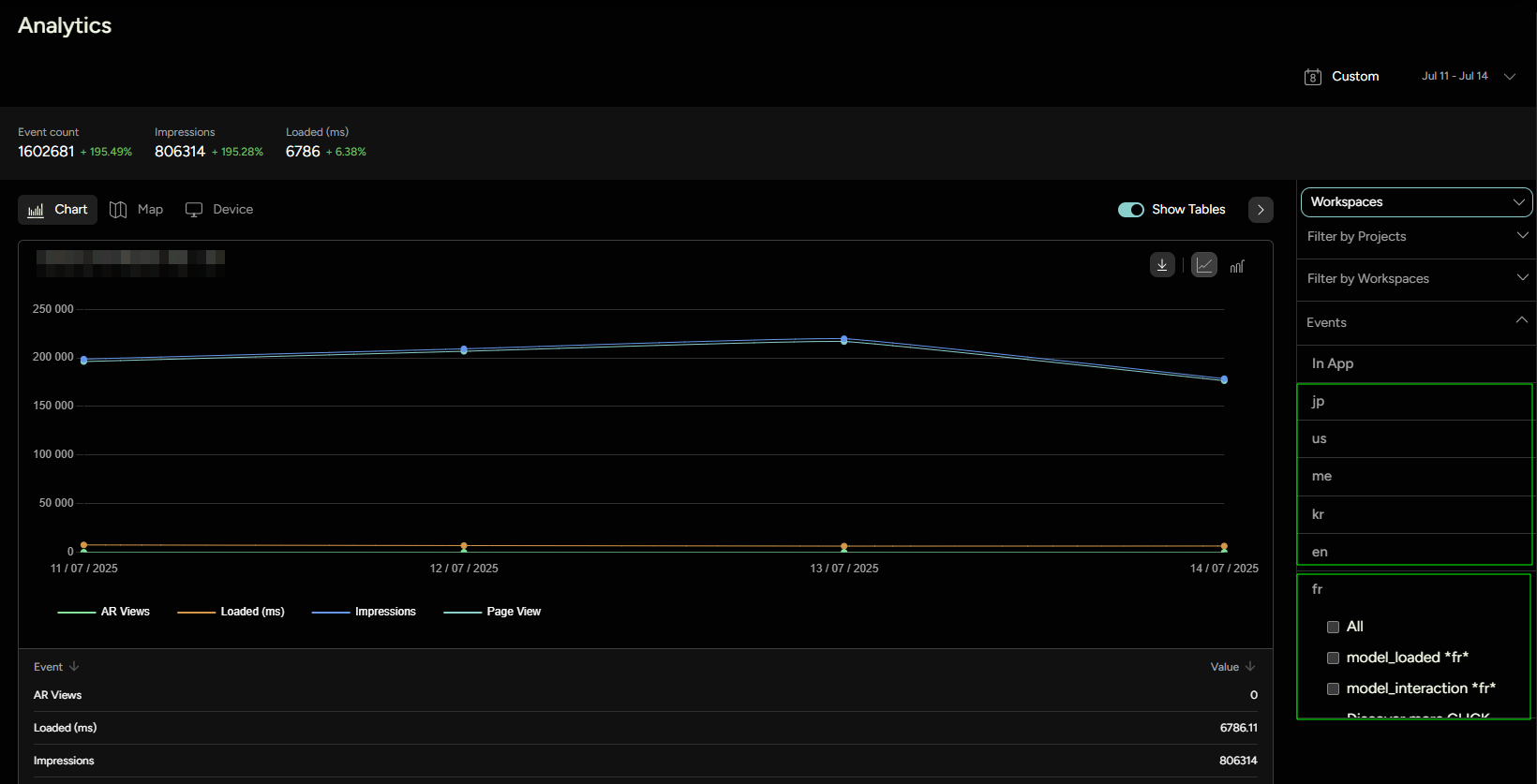
Let's imagine we are building a 3D Banner Ad. We want to separate the report into different languages the ad is served: jp, fr, kr, us etc. We can make those different categories, and within them we can have different events: model_loaded - fr, model_interaction - fr, CTA click "Discover More" - fr, and similarly structure event names for each language.
This is what the dashboard would look like:
After selecting all relevant events, we can start inspecting the analytics report.
Report
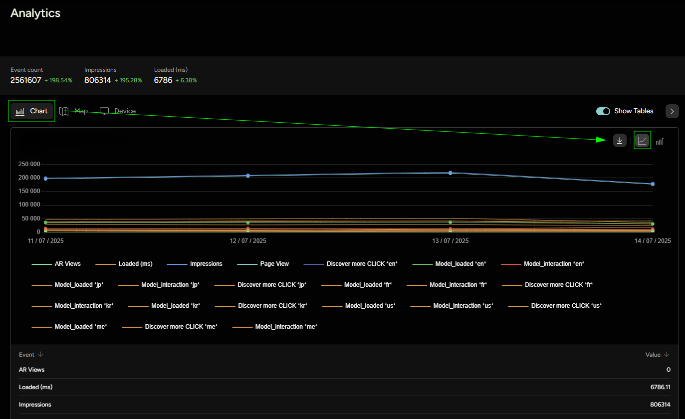
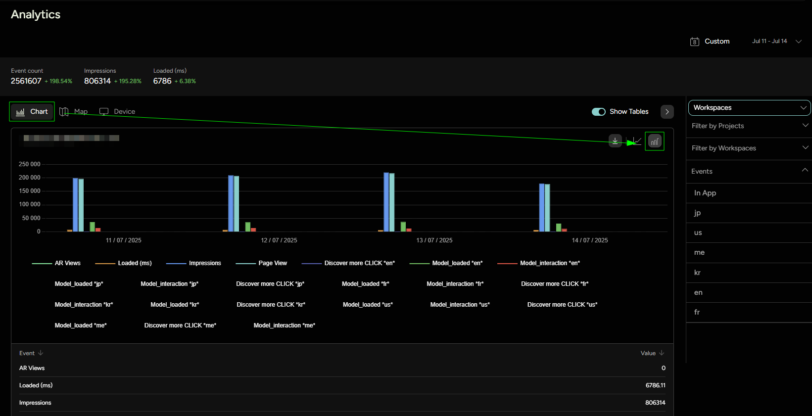
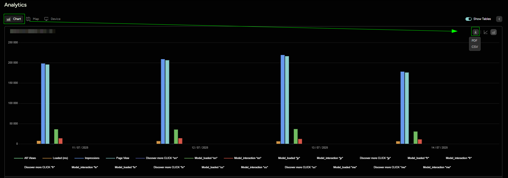
Chart
As seen in Figure 7, all the selected events are now displayed on the graph and also listed below the graph by their category, along with their corresponding counts. Users have the option to choose between two different graph views: Bar Graph and Line Graph. Additionally, it's possible to click on a specific event in the legend to toggle its visibility on the graph.
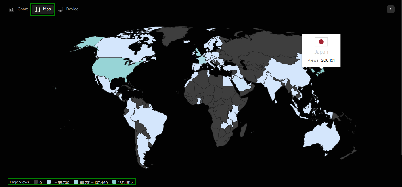
Map
The world map visualization allows users to see which countries are generating views. Hovering over a country on the map will display the exact view count from that location.
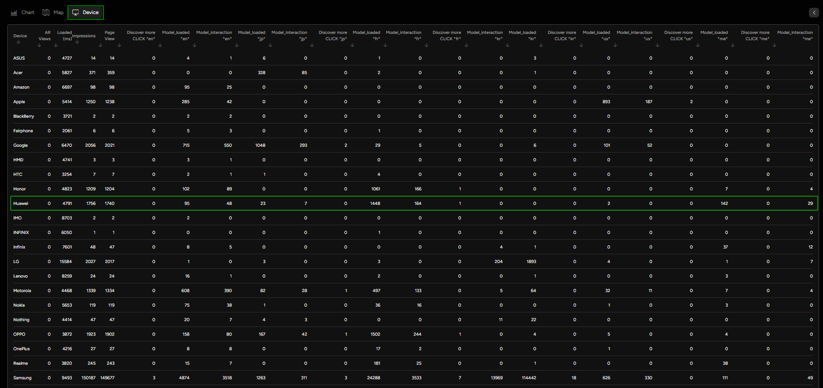
Device
In the Device section, event counts are categorized by device type, such as iPhone, Huawei, Asus, and others. This enables users to gain insights into which devices are most frequently used to interact with their content.
Download Report
For further analysis or to share your analytics findings with your team or clients, you can download the detailed reports from the dashboard. Threedium Platform provides two convenient formats for report downloads:
PDF: This option packages your analytics data into a polished, presentation-ready format. It includes tables detailing the event counts and also incorporates graphical data representations such as the graph and world map visualizations. The PDF format is ideal for sharing a visual and easy-to-understand snapshot of your analytics performance in meetings or reports.CSV: Choosing a CSV (Comma-Separated Values) file allows you to download a raw, tabular representation of the event counts. The CSV format is perfect for importing data into spreadsheet applications like Microsoft Excel or Google Sheets, where you can perform custom analyses and data manipulations.
Both formats encapsulate the relevant data of your selected time frame and event categories, ensuring that you have all the necessary analytics insights at your fingertips. Whether you need a visual summary or raw data for number crunching, these download options have you covered.
For workspaces that were published using versions of the Threedium Platform prior to 2.14.4, the comprehensive analytics dashboard introduced in the aforementioned version will not display any data, as the advanced tracking capabilities were not present.
If you wish to benefit from the enhanced tracking and detailed analytics introduced in version 2.14.4 or later, you would need to republish your 3D experiences using a newer version of the Threedium Platform. This will ensure your projects are upgraded to enable the full range of analytics features, including custom event tracking and the new reporting interface.